SafetyCulture
SC Training
2025
UI design
This project involved the UX/UI design for SafetyCulture Training, a mobile-first learning management system aimed at simplifying and enhancing training for frontline teams across diverse industries. The platform is designed to help businesses efficiently onboard, train and upskill their employees, ensuring compliance and improve operational efficiency.
This portfolio piece showcases the new homepage design that launched early 2025 to align with our new business strategy. I was responsible for the full spectrum of the design process, from understanding user needs and business objectives to delivering a polished, functional, and engaging user interface.
In the first 2 weeks of launch, we saw that 15% of users were more likely to convert just from the hero banner alone. Homepage sessions increased 33.03%, active users increased 45.62% and key events (new accounts created) increased by 305 users in the first 2 weeks.
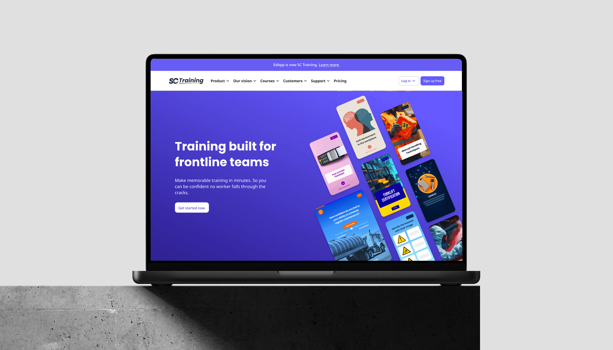
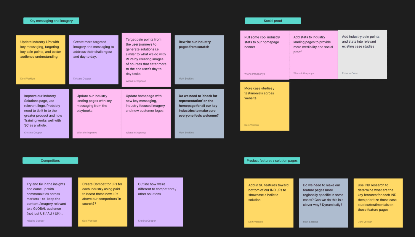
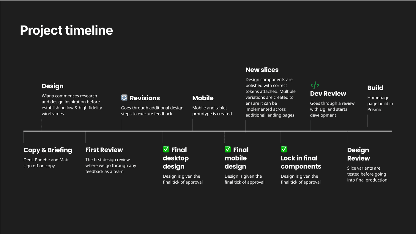
Designing a homepage from start to finish involves a comprehensive UXUI process, moving from understanding the core problem to delivering a polished and effective solution. As a team, we brainstormed in FigJam what our customer's pain points were on our old homepage, our objectives as a business and clear deliverables outlining goals, KPIs and initial requirements.
Reporting to Head of Marketing, my immediate team who also collaborated in this homepage project consisted of a product marketer, senior copywriter, a front-end engineer and AI-technologist.
For this project, the design considerations revolved around 4 key areas: our product, our customers, our brand, and the overall user experience.
Regarding our product, a primary goal was to showcase it in its most authentic form. The aim was to reassure users about exactly what they would receive upon signing up, fostering trust and transparency from the outset.
When it came to our customers, the focus was on how to "hero" them. We wanted to highlight their experiences and contributions to enhance social proof, thereby building a stronger sense of community and reliability around our offering.
For our brand, the objective was to update our visuals. This involved moving away from the use of coloured gradients to create a fresh and modern aesthetic that better reflects our current identity.
Finally, for the experience, a crucial consideration was how to integrate more animations. This was intended to modernise our designs, making them more engaging and dynamic for the user.
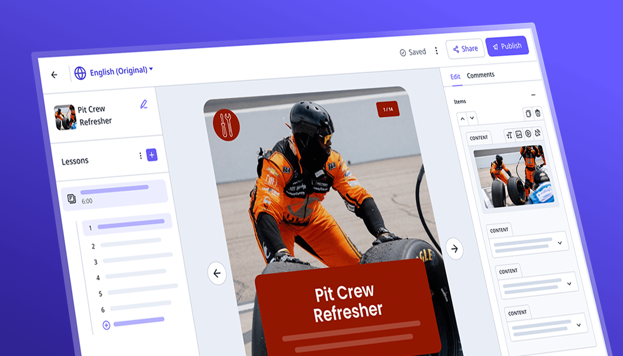


These were some of the rebranded images designed for the homepage to showcase our product offering and really hone in on our audience. Our homepage sessions increased and converted well due to the new user experience we were able to create. Every step of the homepage was calculated and each workflow was intensional to drive conversion.
Below are high fidelity wireframes of our previous 2024 homepage VS our new 2025 homepage.

Next Project: Xela Swim